In the 14th century an intellectual movement called Humanism occured. Humanists believed that each individual was important within society. In 1440s-50s, humanist faith in classical scholarship led to search for ancient texts in order to increase scientific knowledge. There were many studies in many areas: physiology, anatomy, geography, botany, zoology, magic, alchemy, astrology, astronomy...
Some of the significant achievements:
- COPERNICUS: Placed the sun at the center of the universe
- GALILEO: Invented an accurate telescope
- BRAHE: Gave an accurate estimate of planetary positions
- KEPLER: Suggested that planetary orbits were elliptical.
The Renaissance Book
Humanism began as an intellectual movement to revive ancient Greek and Roman literature and education; but it soon turned to other fields as agriculture, politics, social relations, architecture, music, and medicine. This great influx of knowledge made the production of secular books a must.
In the middle ages magnificient illuminations were rarely used for the decoration of secular books, but in Renaissance secular books could be rivals of sacred books in elegance of script, illumination and binding.
Examples of pages of Renaissance styled secular books:
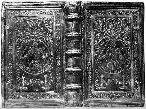
Examples of bookbindings of Renaissance books:
Masters of Type in Renaissance
New humanist writings required new type of fonts that would be more secular and more legible. Page designs started to become lighter, and had much more white space. There was one problem and that was Roman alphabet didn't have lowercase letters. So Renaissance typographers endeavored in defining lowercase letters.
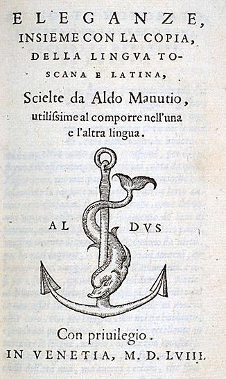
- ALDUS MANUTIUS:
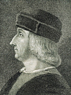
He was a humanistic scholar and a tutor for several ducal families. One of the families provided him with money to establish a printery in Venice.
To save space in Latin texts he had a type designed after the Italian cursive script. This was the first italic type used in books (in 1501)
Books produced by him are called Aldine and they bear his mark which was a dolphin and an anchor.
A PAGE OF A BOOK HE PRINTED
WITH HIS MARK ON
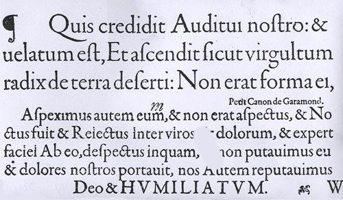
- CLAUDE GARAMOND:
He was a Parisian publisher and one of the leading type designers of his time. Several of his typefaces are still in use, especially Garamond. There are several typefaces called Garamond. The original Garamond belongs to the family of Renaissance/Old Syle serif typefaces.
THE ORIGINAL CLAUDE GARAMOND TYPEFACE
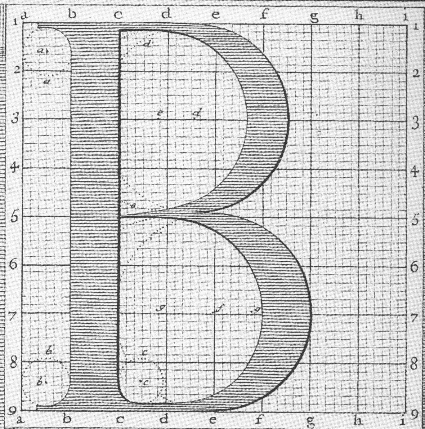
- GEOFFROY TORY: He was one of the major printers in Paris during the early 16th century. In 1529, he wrote and printed theoretical treatise on the design of Roman capital letters. In this treatise he shows how to draw letters with geometrical aids, and how their proportions relate to the human body.

The Baroque Masters of Type
Baroque masters of type took the art of book design and typography one step further. Pages became even whiter, margins broader and type even more refined. One of the most beautiful characteristics of Baroque page design is typographic flourishes.
AN EXAMPLE OF BAROQUE
TYPOGRAPHIC FLOURISH
- PHILIPPE GRANDJEAN: He was a French type engraver mostly known from his series of Roman and Italic types known as Romain du Roi (King's Roman)

- WILLIAM CASLON:
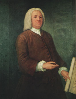
He was an English gunsmith and designer of typographic fonts. The distinction and legibility of his type secured him the patronage of the leading printers at those times. His typeface were influenced by Dutch types. Later, his work influenced John Baskerville and thus the pregenitors of Transitional types which led to Modern types.
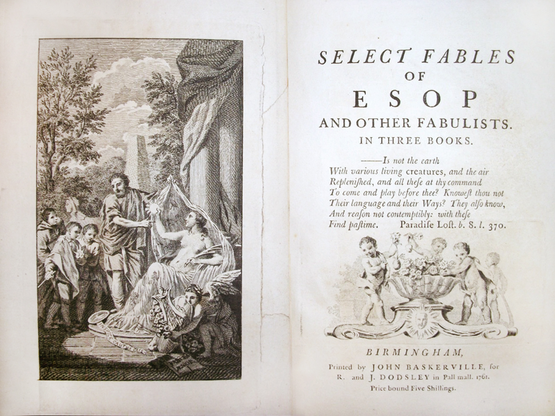
- JOHN BASKERVILLE:
He was a printer in Birmingham, England, and a member of the Royal Society of Arts. His fonts were greatly admired by Benjamin Franklin who was a fellow member of the Royal Society of Arts. Franklin took the designs back to the newly-established United States and they were adopted for most federal government publishing.
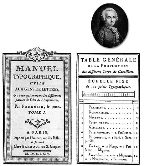
- PIERRE SIMON FOURNIER:
He was a French punch-cutter, typefounder and typographic theoretician. Typefaces designed by him include Fornier and Narcissus. In 1737, Fornier published his first theoretical work, on the minimum spacing between letters while preserving readability. The typefaces that Fournier and successors created had extreme contrast between thin and thick strokes.
The Masters of Type of the Enlightenment







Hiç yorum yok:
Yorum Gönder