25 Kasım 2012 Pazar

The Masters of Type

     The Renaissance is the term used to desribe the development of Western civilization that marked the transition from medieval to modern times.
     In the 14th century an intellectual movement called Humanism occured. Humanists believed that each individual was important within society. In 1440s-50s, humanist faith in classical scholarship led to search for ancient texts in order to increase scientific knowledge. There were many studies in many areas: physiology, anatomy, geography, botany, zoology, magic, alchemy, astrology, astronomy...
Some of the significant achievements:
  • COPERNICUS: Placed the sun at the center of the universe
  • GALILEO: Invented an accurate telescope
  • BRAHE: Gave an accurate estimate of planetary positions
  • KEPLER: Suggested that planetary orbits were elliptical.
And one of the most important benefits of this era was the SPREADING OF LITEARACY.

The Renaissance Book
   Humanism began as an intellectual movement to revive ancient Greek and Roman literature and education; but it soon turned to other fields as agriculture, politics, social relations, architecture, music, and medicine. This great influx of knowledge made the production of secular books a must.
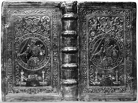
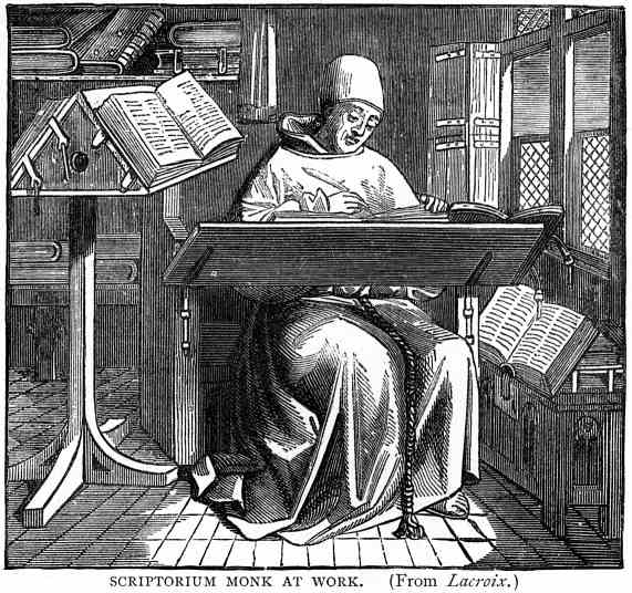
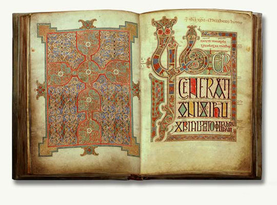
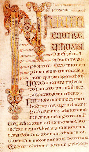
    In the middle ages magnificient illuminations were rarely used for the decoration of secular books, but in Renaissance secular books could be rivals of sacred books in elegance of script, illumination and binding.

Examples of pages of Renaissance styled secular books:


Examples of bookbindings of Renaissance books:


Masters of Type in Renaissance
     New humanist writings required new type of fonts that would be more secular and more legible. Page designs started to become lighter, and had much more white space. There was one problem and that was Roman alphabet didn't have lowercase letters. So Renaissance typographers endeavored in defining lowercase letters.
  • ALDUS MANUTIUS:


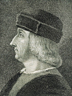
 He was a humanistic scholar and a tutor for several ducal families. One of the families provided him with money to establish a printery in Venice.
To save space in Latin texts he had a type designed after the Italian cursive script. This was the first italic type used in books (in 1501)
Books produced by him are called Aldine and they bear his mark which was a dolphin and an anchor.


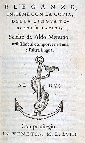
A PAGE OF A BOOK HE PRINTED
WITH HIS MARK ON


  •  CLAUDE GARAMOND:


 He  was a Parisian publisher and one of the leading type designers of his time. Several of his typefaces are still in use, especially Garamond. There are several typefaces called Garamond. The original Garamond belongs to the family of Renaissance/Old Syle serif typefaces.


THE ORIGINAL CLAUDE GARAMOND TYPEFACE


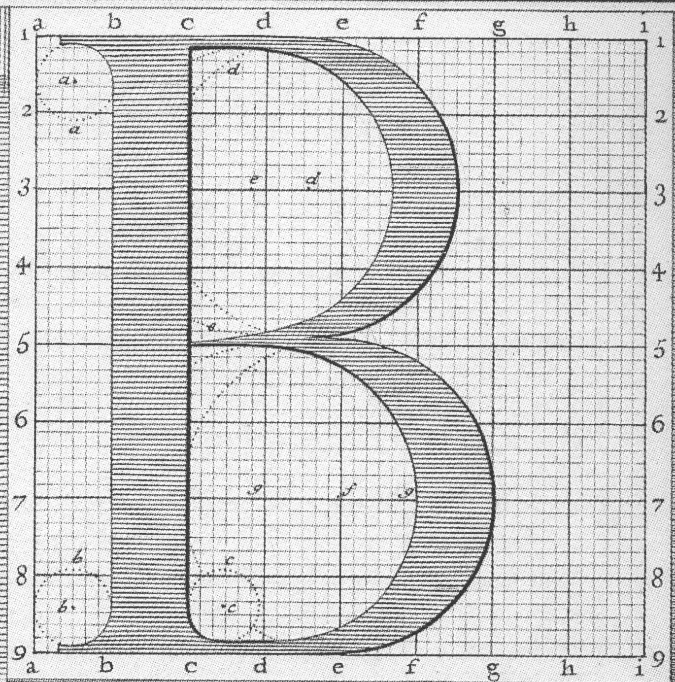
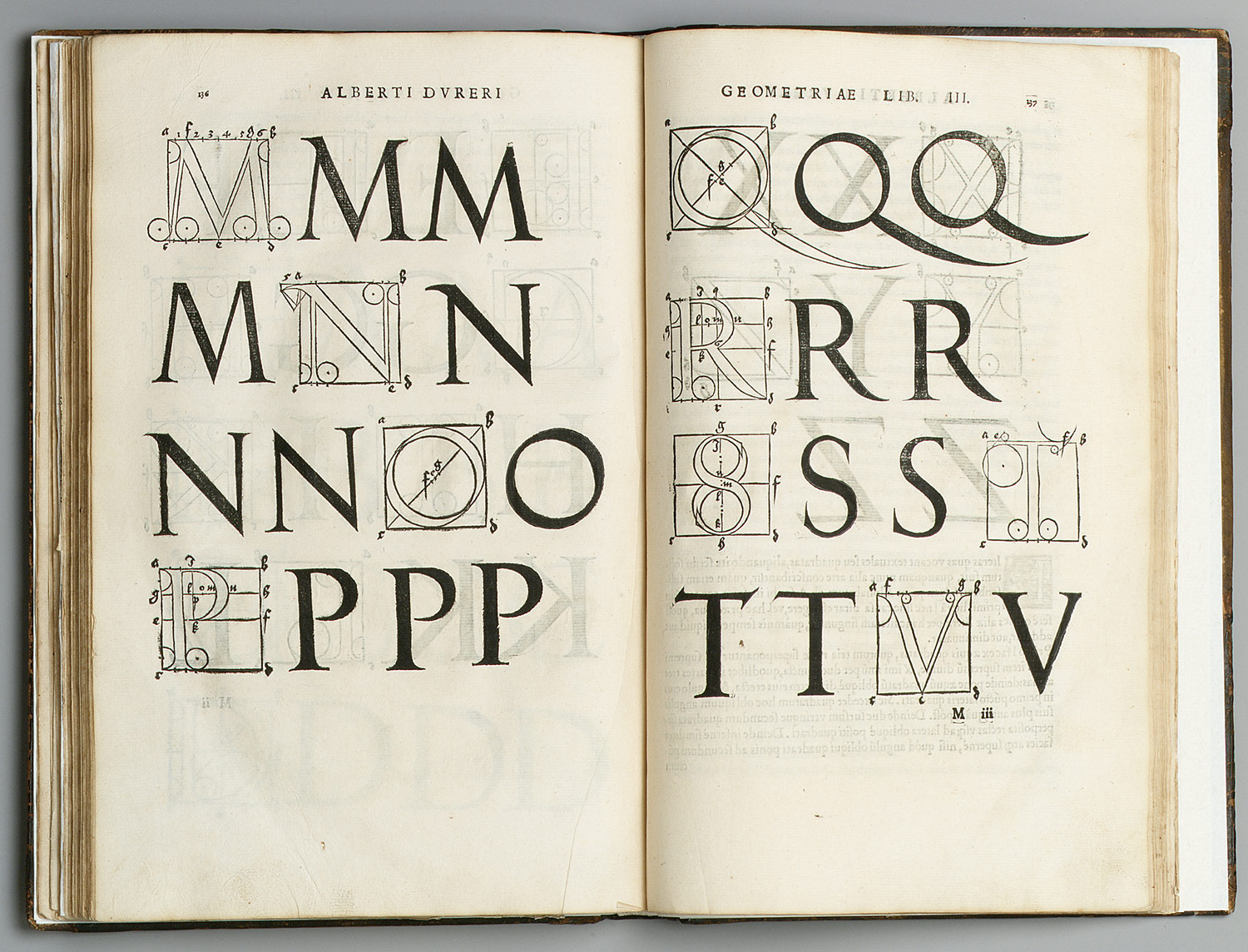
  • GEOFFROY TORY: He was one of the major printers in Paris during the early 16th century. In 1529, he wrote and printed theoretical treatise on the design of Roman capital letters. In this treatise he shows how to draw letters with geometrical aids, and how their proportions relate to the human body.


 The Baroque Masters of Type


     Baroque masters of type took the art of book design and typography one step further. Pages became even whiter, margins broader and type even more refined. One of the most beautiful characteristics of Baroque page design is typographic flourishes.


AN EXAMPLE OF BAROQUE
TYPOGRAPHIC FLOURISH


  • PHILIPPE GRANDJEAN: He was a French type engraver mostly known from his series of Roman and Italic types known as Romain du Roi (King's Roman)


  • WILLIAM CASLON:


 He was an English gunsmith and designer of typographic fonts. The distinction and legibility of his type secured him the patronage of the leading printers at those times. His typeface were influenced by Dutch types. Later, his work influenced John Baskerville and thus the pregenitors of Transitional types which led to Modern types.
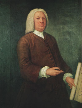
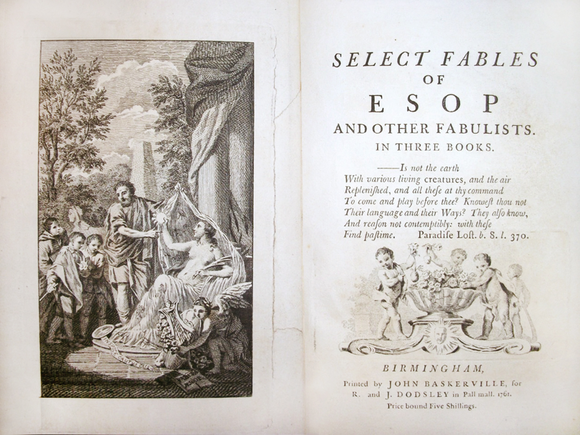

  • JOHN BASKERVILLE:


He was a printer in Birmingham, England, and a member of the Royal Society of Arts. His fonts were greatly admired by Benjamin Franklin who was a fellow member of the Royal Society of Arts. Franklin took the designs back to the newly-established United States and they were adopted for most federal government publishing.


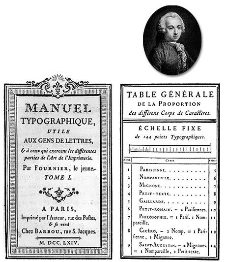
  • PIERRE SIMON FOURNIER:


He was a French punch-cutter, typefounder and typographic theoretician. Typefaces designed by him include Fornier and Narcissus. In 1737, Fornier published his first theoretical work, on the minimum spacing between letters while preserving readability. The typefaces that Fournier and successors created had extreme contrast between thin and thick strokes.


The Masters of Type of the Enlightenment

13 Kasım 2012 Salı

The Printing Press

Incunabula
An incunabulum is a book, single sheet, or image that was printed- not handwritten!-before the year 1501. Incunabula is latin for "swaddling clothes", implying the infancy or early stages of something.


The Introduction of Rag Paper
    The word paper comes from the ancient Egyptian writing material called papyrus.
    Papyrus plants were quite fastidious so it was hard to produce papyrus.Thus parchment (or vallum) which was made out of sheepskin or calfskin replaced papyrus. In the meantime, in China bamboo was the writing material, but it was very heavy and awkward to transport. All of these materials were either rare or costly. So a seach was provoked for a cheaper and easier to produce writing surface.
    Paper remained a luxury item until steam-driven paper making machines were invented in the 19th century. Before this era, books and newspapers were rare objects thus illiteracy was very normal. But with gradual introductionof cheap paper; newspapers, books etc. became available to nearly all of the members of the industrial society.

Johannes Gutenberg

    He was a German goldsmith and inventor who invented the technology of printing with movable types in 1447.
    Gutenberg began experimenting with metal typography around 1430 since to reproduce wood-block type was very challenging.
He determined that metal type could be reproduced much more easily and quickly once a mold had been created.
    In 1455, Gutenberg demonstrated the power of printing press by selling copies of a two-volume Bible (Biblia Sacra). This Bible caused a cultural revolution. But still, it lacks many modern print features such as pagination, word spacing, paragraph breaks etc.


An example of movable metal types.


The inside pages of the Gutenberg Bible.


The Gutenberg printing press.


The Golden Canon of Page Construction
Raul Rosarivo was the first one to analyze Renaissance books with the help of compass and ruler; and he concluded that Gutenberg applied the golden canon of page construction to his work.


Albrecht Dürer


He was a German painter, wood carver and mathematician. He made great contributions to graphic design by analyzing geometry of letters and works on book design.


A page from Dürer's book Unterweysung der Messung (A Course on the Art of Measurement) in which he analyzed the geometry of letters.

The Art of the Book

In the medieval Europe some of the greatest book designers created some of the most beautiful books of the world. These books are called Illuminated Manuscripts.
An illuminated manuscript is a manuscript that contains text along with decorations or illustrations.
The majority of manuscripts that had survived to this day are from the Medieval era, and there are  some manuscripts from the15th century Renaissance and late Antiquity.
The most common theme was religion.

The Scriptorium
In the monasteries, the scriptorium was a room that the professional copying of manuscripts were carried on. Illuminations were added later by a separate class of specialists.


Techniques
Illumination was a complex and costly process. When papyrus, the writing surface of choice in Antiquity, became overly expensive, parchments were started to be used instead of it. Then in the 13th century paper began to displace parchment.
In the making of an illuminated manuscript, the text was written first. After the general layout of the page was planned and the page was lightly ruled, text was written.
When the text was complete, the illustrator did the illumination. The designs were planned out on wax tablets beforehand, and they were traced onto the parchment.

Types of Manuscripts
  • Insular/Celtic Manuscript: They were produced in monastic centers on the British Isles in the 7th and 8th centuries. They were written in uncial(entirely in capital letters) or half uncial script , and were the first ones to contain spaces between words. They were decorated in abstract linear patterns.
 

  • Ottonian Manuscript: They were influenced by Byzantium, featuring the use of burnished gold backgrounds and latge eyed figures that pose stiffly.


  • Carolingian Manuscripts: They appeared in the time of Charlemagne. In this period, manuscript production expanded from the monasteries to secular workshops.


  • Romanesque Manuscript: The Romanesque style was an international style rather than a national style, since the examples of it come from a wide area. It  emerged around the year 1000. Romanesque manuscripts contain a variety of real and imaginary creatures called grotesques, textured or gold backgrounds and historiated initials.


  • Gothic Manuscripts: The Gothic style emerged around 1150. Like Romanesque, it was an international style. Generally there was less text on a Gothic styled page, and the blank spaces in lines were filled with decorative bars. Decorative scrolls of ivy leaves were a feature of many Gothic manuscripts.


Books of Hours
They are the most common type of illuminated manuscript that survived from medieval times. Each Book of Hours is unique, but they all have a collection of texts and prayers, along with illustrations. They are convenient references for Christian worship and devotion.


Initials and Diminuendo
Diminuendo is the art of arranging letters starting with a large initial and progressively decreasing the point size of the type. This feature is still being used today in contemporary editorial design.


The History of Alphabet

The history of the alphabet started in ancient Egypt. The first pure alphabets developed by Semitic workers in Egypt around 2000 BC. Most of other alphabets were influenced by these, including the Phoenician alphabet and the Greek alphabet.

The Phoenician Alphabet
It emerged in the mid 11th century B.C, and it was based on the principle that one sign represents one spoken sound.Phoenician alphabet gave rise to the Aramaic, Greek and Berber alphabets.

 PHOENICIAN ALPHABET


THE ARAMAIC ALPHABET

 THE ANCIENT GREEK ALPHABET


The Greeks
Ancient Greek is considered to be the period when the foundational culture of Western civilization emerged. From 1100 B.C. to the 8th century B.C. is called the "Dark Age" because there was no text survived from that period. From about  800 B.C. Greeks created the Greek alphabet by modifying the Phoenician alphabet.
The most notable change in the Greek alphabet, as an adaptation of the Phoenician alphabet, is the introduction written vowels.


The Romans
Around 9th century B.C. the Roman civilization grew on the Italian Peninsula, and eventually this civilization became a big empire.
The Roman civilization was greatly influenced by the Greek civilization. But later they contributed greatly to the development of the Western world.
It is believed that the Romans used the Greek alphabet as the basis for the uppercase alphabet.
Romans made great contributions to type design:
  • Serifs: They originated from the carvings of word into stone. Little hooks were started to be added in order to prevent the tips of letter chisels from slipping, and this emerged serifs.


EXAMPLES OF ANCIENT ROMAN WRITINGS:


  • Baseline: It is the line upon which most letters sit and under which descenders extend. Baseline is one of the essentialsof typography, that organizes the places of words.


By 100 A.D. the book industry of Romans became very acomplished. They invented a type of handwritten book called the Codex(Latin for block of wood) It was easier to read, and to transport. Moreover it was very durable.