10 Ocak 2013 Perşembe

Breaking the Grid

    In design, breaking the grid began with Industrial Revolution in the late 18th and 19th century in Britain. It eventually spread through the whole world. It changed the cultural, social, economic and technological aspects of the countries. It was at that time that steam power and powered machinery were introduced.

Breaking the Grid:  In printing using movable type made the graphic design very inflexible. For example; illustrations, maps and thing like those were hand drawn and engraved which made the printing process hard and costly. With the industrial revolution an invention called lithography came to the scene which erased this problem.
        Lithography: It refers to a printing process in which chemicals were involved. The process was like this:
  •  The positive part of the image had chemical on it, while the negative image had water.
  • When the plate that had positive and negative parts was introduced to ink and water mixture, the ink would stick to the positive part while water would clean the negative image.
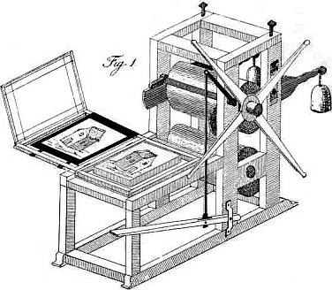


 An old lithography machine


        Photography: It's a process of making pictures through the action of light with devices that are called cameras. The first photograph was produced in 1826 by the French inventor Nicephore Niepce.
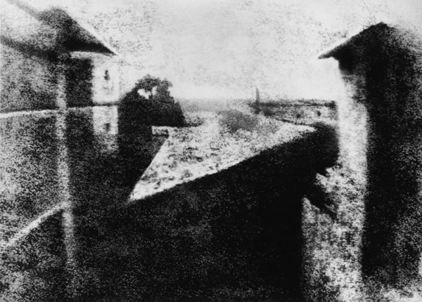


The first photograph


        Middle classes that emerged with the introduction of the Industrial Revolution, made huge amounts of demands for photography as a means of portraiture. This triggered the development of photography.
        In earlier times the cost of just one photo was very expensive. In 1884 George Eastman developed film and made photography much less costly and much more easier.

The Victorian Era
It was a period of profound sexual repression. In terms of fashion, men wore formal and stiff clothes, while women wore clothes that were covering the entire body even an ankle not to be shown.


Victoriana: It refers to items or materials from the Victorian period. It reflects two phenomena;
  • necessity to appeal to the wealthy people's tastes
  • ability of large masses of the population becoming wealthy and ability to travel due to the introduction of steam powered vehicles.
 Thus, exotica and kitsch made frequent appearances in victoriana.
  Kitsch: The term refers to any art or design that is pretentious and in bad taste. Kitsch lacks creativity, simply repeating a formula.

 Examples of kitsch:


The Arts and Crafts Movement (late 19th c. -early 20th c.)
It was an American and British aesthetic movement that influenced architecture, decorative arts, crafts etc.
The aim of the movement was to find a meaningful style for 19th century. The people from this movement didn't like cold, machine-made designs.

      William Morris: He was an English artist, writer and one of the leading names of the Arts and Crafts Movement. He is best known for his patterned wallpapers and fabrics.


Examples of his pattern designs:


Eclecticism
It didn't have any specific style; according to David Hume- a Scottish philosopher and historian- eclecticism is the borrowing of a variety of styles from different sources and combining them." It was an important design concept for Western culture, where oriential- especially Japanese- style of art traditions.


Art Nouveau
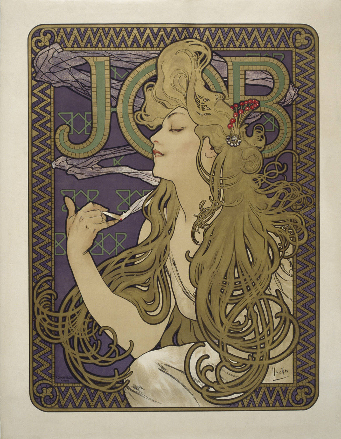
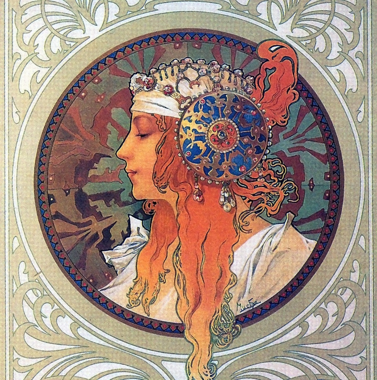
It started at the end of the 19th century and sort of ended with the World War I. One of the key characterics of Art Nouveau is that it doesn't contain any straight lines and any right angle, so many of the Art Nouveau products resemnle living organisms in some way. The artists liked to use variety of flowers and plants as models or as parts of their design.

Posters: With Art Nouveau poster design flourished. There were two important designers of this movement:

1) Henri de Toulouse-Lautrec


2) Alfons Mucha

25 Kasım 2012 Pazar

The Masters of Type

     The Renaissance is the term used to desribe the development of Western civilization that marked the transition from medieval to modern times.
     In the 14th century an intellectual movement called Humanism occured. Humanists believed that each individual was important within society. In 1440s-50s, humanist faith in classical scholarship led to search for ancient texts in order to increase scientific knowledge. There were many studies in many areas: physiology, anatomy, geography, botany, zoology, magic, alchemy, astrology, astronomy...
Some of the significant achievements:
  • COPERNICUS: Placed the sun at the center of the universe
  • GALILEO: Invented an accurate telescope
  • BRAHE: Gave an accurate estimate of planetary positions
  • KEPLER: Suggested that planetary orbits were elliptical.
And one of the most important benefits of this era was the SPREADING OF LITEARACY.

The Renaissance Book
   Humanism began as an intellectual movement to revive ancient Greek and Roman literature and education; but it soon turned to other fields as agriculture, politics, social relations, architecture, music, and medicine. This great influx of knowledge made the production of secular books a must.
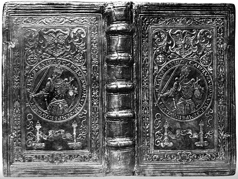
    In the middle ages magnificient illuminations were rarely used for the decoration of secular books, but in Renaissance secular books could be rivals of sacred books in elegance of script, illumination and binding.

Examples of pages of Renaissance styled secular books:


Examples of bookbindings of Renaissance books:


Masters of Type in Renaissance
     New humanist writings required new type of fonts that would be more secular and more legible. Page designs started to become lighter, and had much more white space. There was one problem and that was Roman alphabet didn't have lowercase letters. So Renaissance typographers endeavored in defining lowercase letters.
  • ALDUS MANUTIUS:


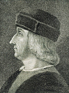
 He was a humanistic scholar and a tutor for several ducal families. One of the families provided him with money to establish a printery in Venice.
To save space in Latin texts he had a type designed after the Italian cursive script. This was the first italic type used in books (in 1501)
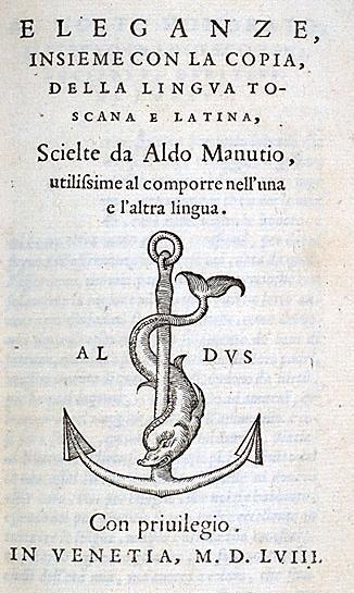
Books produced by him are called Aldine and they bear his mark which was a dolphin and an anchor.


A PAGE OF A BOOK HE PRINTED
WITH HIS MARK ON


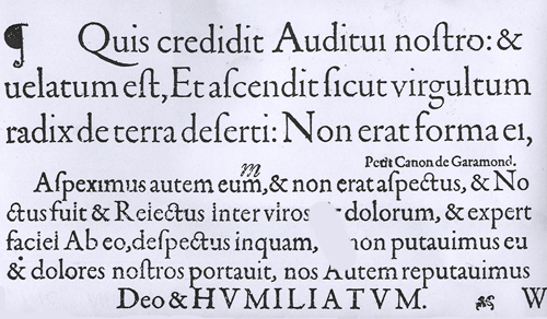
  •  CLAUDE GARAMOND:


 He  was a Parisian publisher and one of the leading type designers of his time. Several of his typefaces are still in use, especially Garamond. There are several typefaces called Garamond. The original Garamond belongs to the family of Renaissance/Old Syle serif typefaces.


THE ORIGINAL CLAUDE GARAMOND TYPEFACE


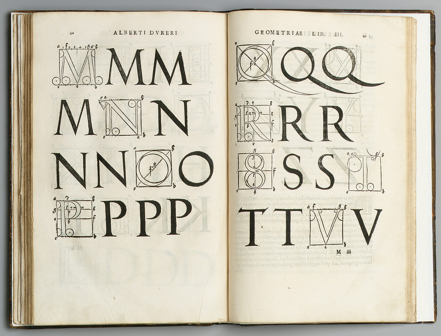
  • GEOFFROY TORY: He was one of the major printers in Paris during the early 16th century. In 1529, he wrote and printed theoretical treatise on the design of Roman capital letters. In this treatise he shows how to draw letters with geometrical aids, and how their proportions relate to the human body.


 The Baroque Masters of Type


     Baroque masters of type took the art of book design and typography one step further. Pages became even whiter, margins broader and type even more refined. One of the most beautiful characteristics of Baroque page design is typographic flourishes.


AN EXAMPLE OF BAROQUE
TYPOGRAPHIC FLOURISH


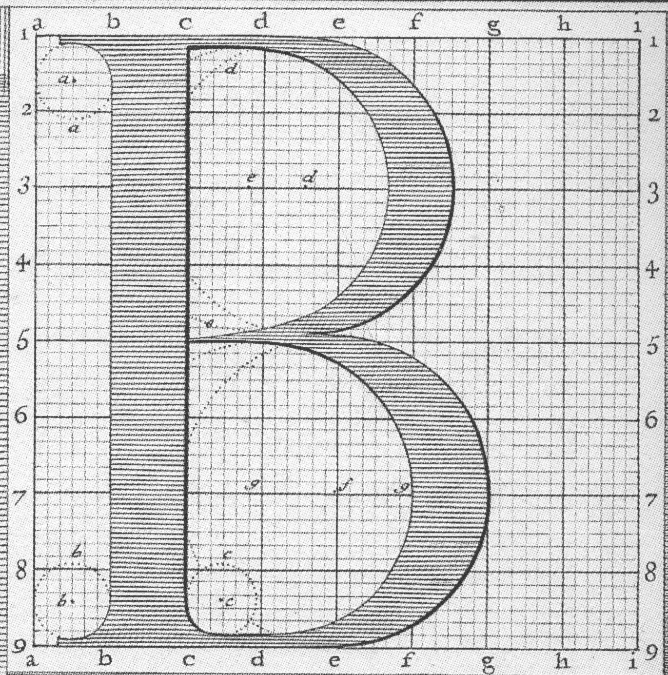
  • PHILIPPE GRANDJEAN: He was a French type engraver mostly known from his series of Roman and Italic types known as Romain du Roi (King's Roman)


  • WILLIAM CASLON:


 He was an English gunsmith and designer of typographic fonts. The distinction and legibility of his type secured him the patronage of the leading printers at those times. His typeface were influenced by Dutch types. Later, his work influenced John Baskerville and thus the pregenitors of Transitional types which led to Modern types.


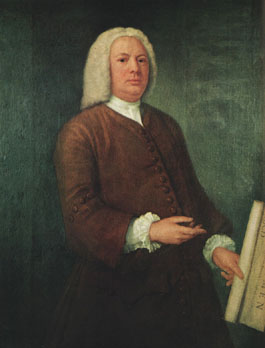
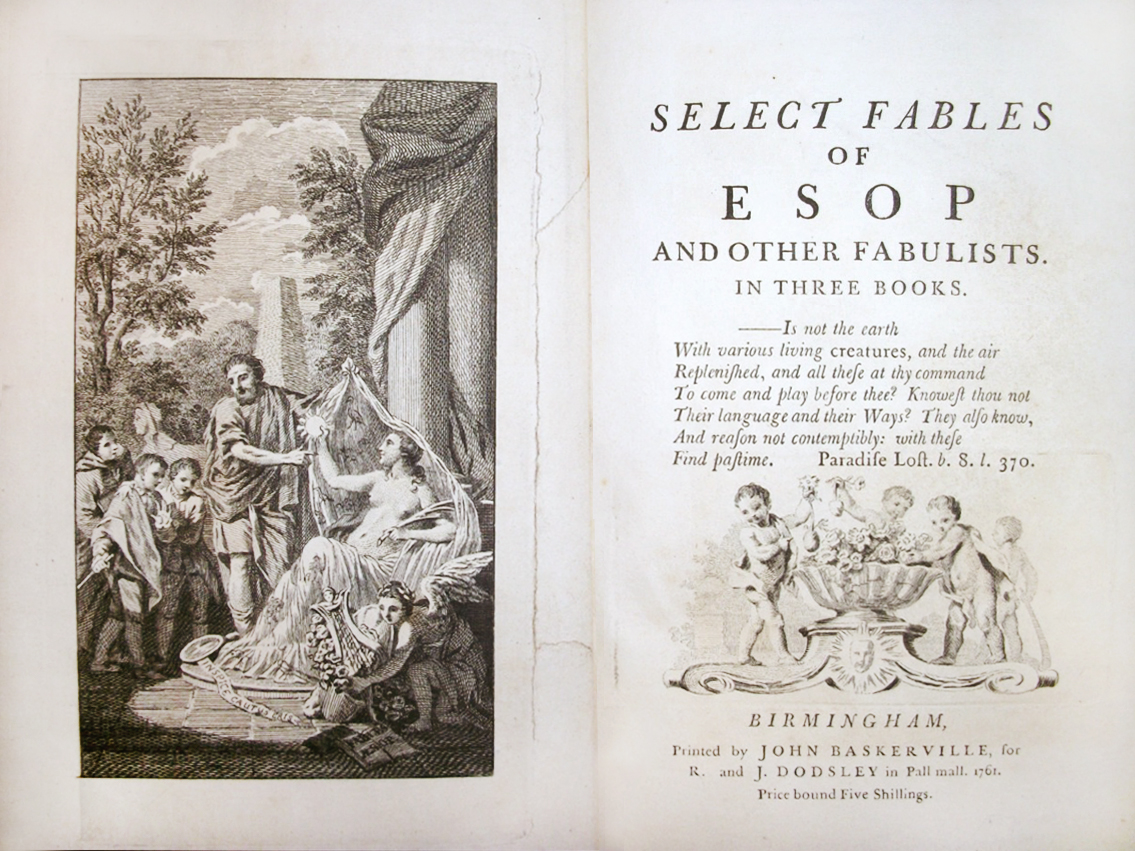
  • JOHN BASKERVILLE:


He was a printer in Birmingham, England, and a member of the Royal Society of Arts. His fonts were greatly admired by Benjamin Franklin who was a fellow member of the Royal Society of Arts. Franklin took the designs back to the newly-established United States and they were adopted for most federal government publishing.


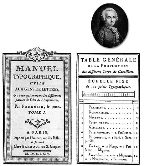
  • PIERRE SIMON FOURNIER:


He was a French punch-cutter, typefounder and typographic theoretician. Typefaces designed by him include Fornier and Narcissus. In 1737, Fornier published his first theoretical work, on the minimum spacing between letters while preserving readability. The typefaces that Fournier and successors created had extreme contrast between thin and thick strokes.


The Masters of Type of the Enlightenment

13 Kasım 2012 Salı

The Printing Press

Incunabula
An incunabulum is a book, single sheet, or image that was printed- not handwritten!-before the year 1501. Incunabula is latin for "swaddling clothes", implying the infancy or early stages of something.


The Introduction of Rag Paper
    The word paper comes from the ancient Egyptian writing material called papyrus.
    Papyrus plants were quite fastidious so it was hard to produce papyrus.Thus parchment (or vallum) which was made out of sheepskin or calfskin replaced papyrus. In the meantime, in China bamboo was the writing material, but it was very heavy and awkward to transport. All of these materials were either rare or costly. So a seach was provoked for a cheaper and easier to produce writing surface.
    Paper remained a luxury item until steam-driven paper making machines were invented in the 19th century. Before this era, books and newspapers were rare objects thus illiteracy was very normal. But with gradual introductionof cheap paper; newspapers, books etc. became available to nearly all of the members of the industrial society.

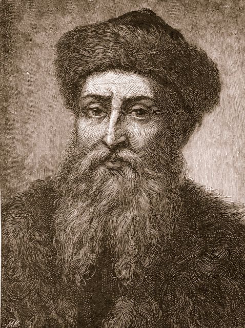
Johannes Gutenberg

    He was a German goldsmith and inventor who invented the technology of printing with movable types in 1447.
    Gutenberg began experimenting with metal typography around 1430 since to reproduce wood-block type was very challenging.
He determined that metal type could be reproduced much more easily and quickly once a mold had been created.
    In 1455, Gutenberg demonstrated the power of printing press by selling copies of a two-volume Bible (Biblia Sacra). This Bible caused a cultural revolution. But still, it lacks many modern print features such as pagination, word spacing, paragraph breaks etc.


An example of movable metal types.


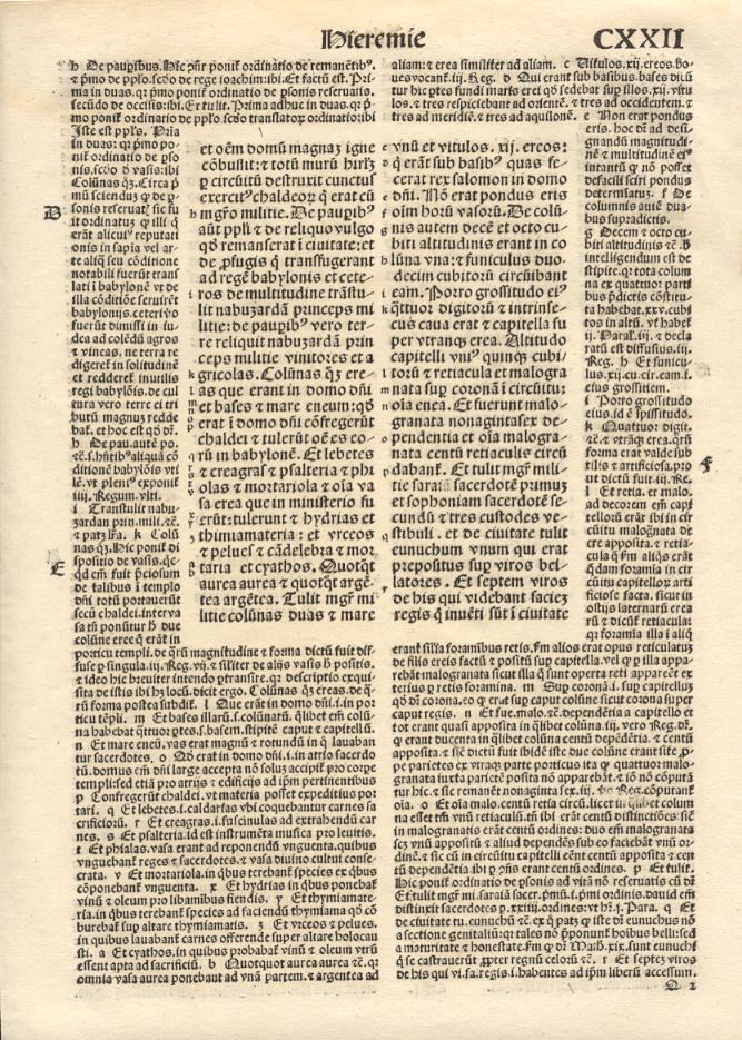
The inside pages of the Gutenberg Bible.


The Gutenberg printing press.


The Golden Canon of Page Construction
Raul Rosarivo was the first one to analyze Renaissance books with the help of compass and ruler; and he concluded that Gutenberg applied the golden canon of page construction to his work.


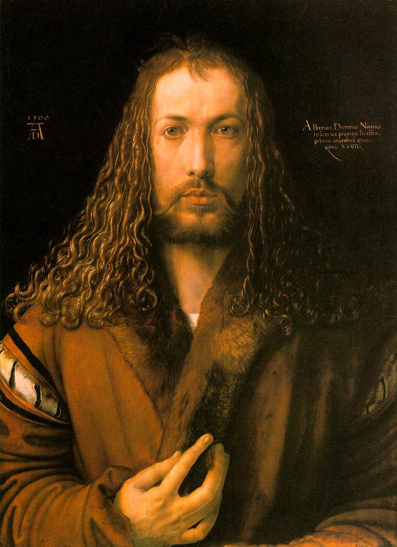
Albrecht Dürer


He was a German painter, wood carver and mathematician. He made great contributions to graphic design by analyzing geometry of letters and works on book design.


A page from Dürer's book Unterweysung der Messung (A Course on the Art of Measurement) in which he analyzed the geometry of letters.